


Copy psychology in the wild
Persuasive visuals + psy-copy® = easier decisions

Believe you’re a logical decision-maker?
Most of the time, none of us are. We all make tens of thousands of decisions every day. We’re not even aware of most of them.
I’m not throwing shade on any of us when I say that lots of our decisions are not as rational as we think.
After all, you couldn’t possibly come up with a fresh, considered decision every time you need to make one. That’s why your brain relies on shortcuts to drive a yes, no or maybe (often without you noticing).
When you understand these shortcuts, it transforms your thinking as a marketer.

Here’s a quick visual/verbal combo example of how shortcuts work.
This charity donation box makes a beeline for the brain’s decision-making biases.
The visuals do the heavy-lifting psychologically here, but don’t underestimate the persuasive power of the accompanying words. It’s a great example of clever design combined with psy-copy®.
Let’s look at five ways that you’re on the receiving end of some cleverly-engineered persuasion right here.
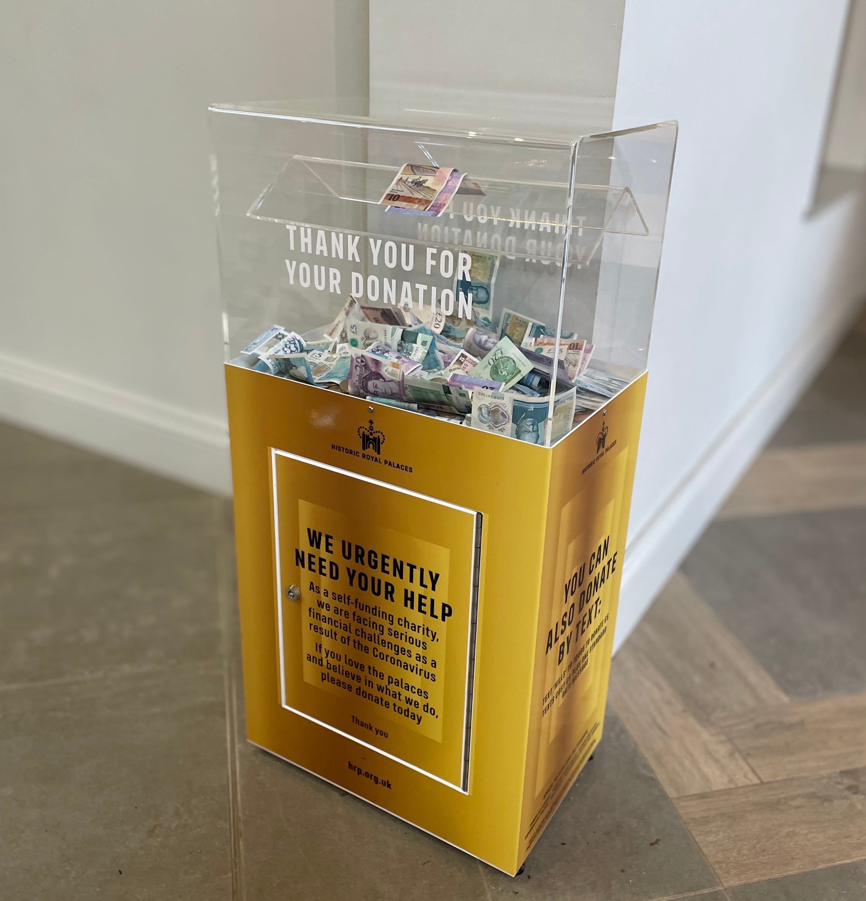
1 See-through design
Firstly, it doesn’t take much analysis to understand why the box is see-through.
It reveals that lots of other people have donated already. The transparent design helps you process that information quickly and easily. Without thinking, in fact.
The design reinforces that, if you’re unsure about donating, you don’t need to give it another thought. Just do what all these other people have done already. That’s social proof in action.
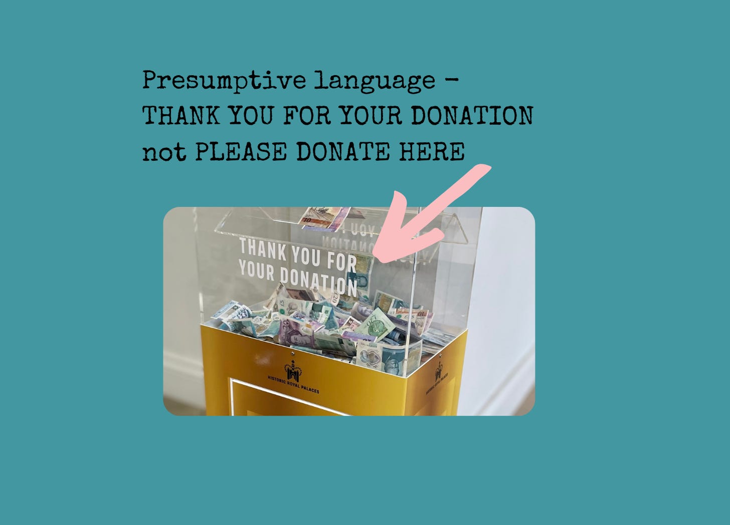
2 Presumptive language
Note that the copy includes a confident ‘Thank you for your donation’ (done and dusted) not ‘Please donate here’ (still to do).
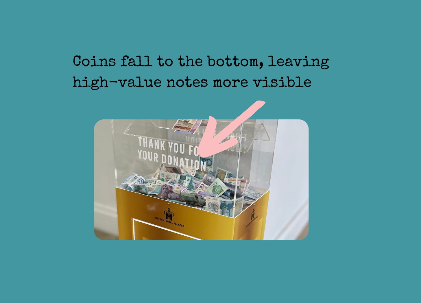
3 A nudge towards notes
The Anchoring Bias means that we’re often overly influenced by the FIRST thing we see or hear. You can learn about other examples of Anchoring Bias here.
This design means you notice the notes first. Coins fall to the bottom and get covered by the higher-value fives, tens and twenties. Those notes also get ‘stuck’ on the roof-like layer, so they’re more obvious, and therefore more salient, than the coins.
Yes, you’re being primed about what amount is appropriate to donate.
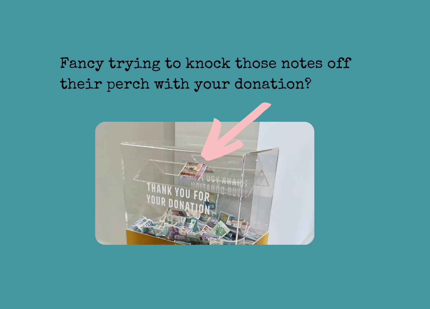
4 Gamification by design
There’s a clever, uncover gaming element here too. That’s why the box somehow reminds you of an amusement arcade game, when you stop to think about it.
Maybe you can knock those notes off their perch with your donation? That tenner is just wavering there. Or if you fold your note and insert it carefully, might it land on the roof? It’s certainly tempting to play.
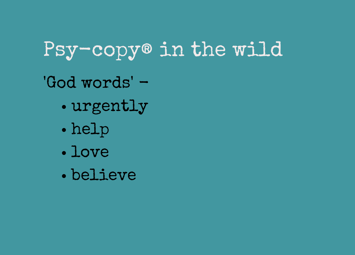
5 Power words in the small print
Now take a closer look at the words. Yes, the visuals do most of the persuading here, but the copy is a fine supporting act.
You’ve probably heard of ‘power words’ in marketing. Copywriters also sometimes call them ‘God words’. If you need an extra verbal nudge beyond the design, you’ll find these God words on rapid fire in the copy with the gold background at the bottom - urgently, help, love, believe.
It’s obvious once you take it apart
What’s interesting about these five tactics is that they’re obvious when you consciously analyse them.
But how often do you actually stop to think when faced with a ‘decision’ in the form of a donation box?
Instead, we all process what we see and read without thinking too deeply, in the context of what’s familiar and easy to understand … clear box, notes, bit like a game, says thanks.
Decision made. Let’s donate.
What an interesting insight, really got me thinking about my own marketing. And your line ‘from sigh-copy to psy-copy’ is so smart, I instantly knew I wanted to sign up, now THATS clever copywriting 👌