


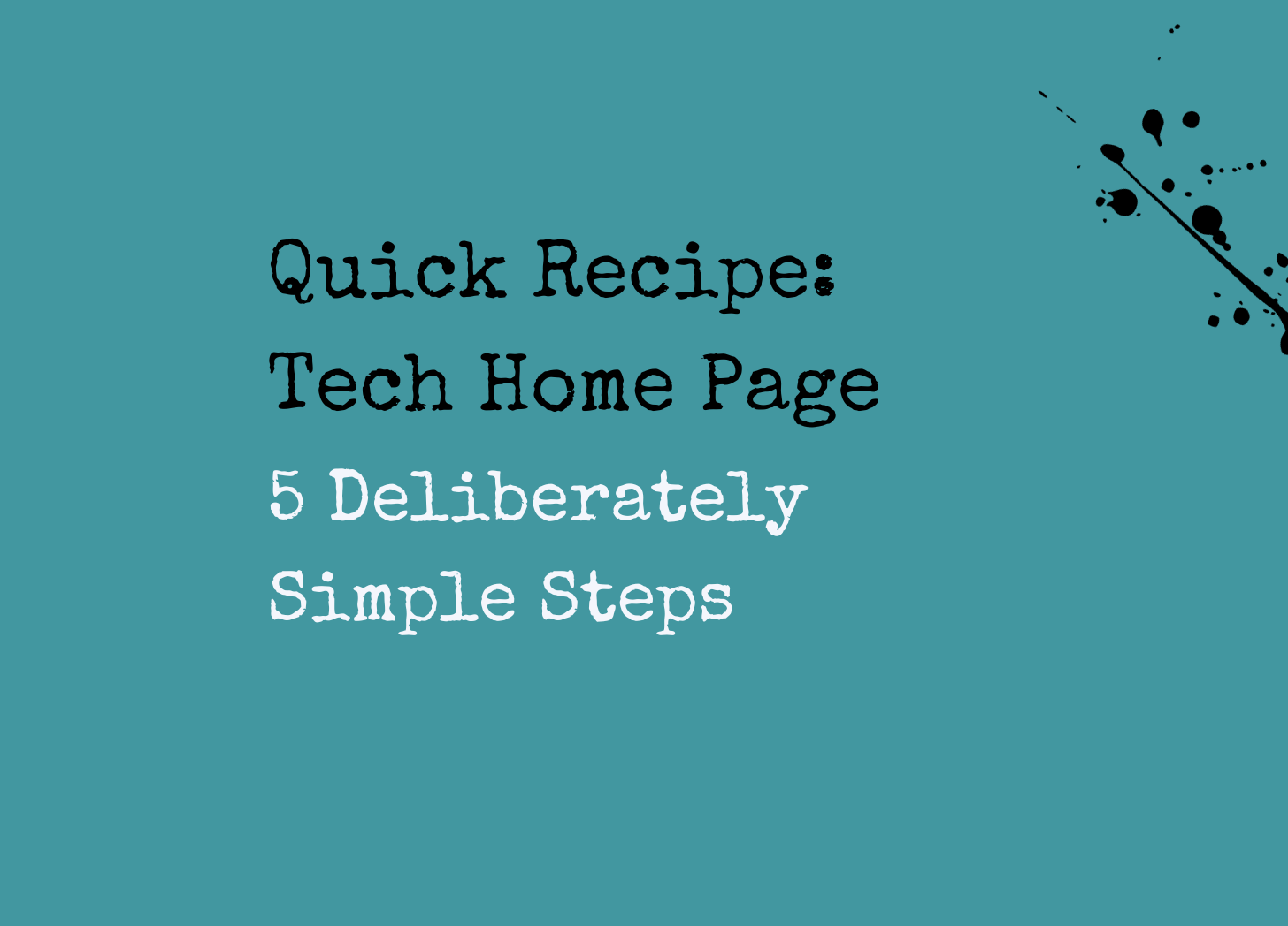
Quick Recipe: your Tech Home Page
Five deliberately simple steps to write your website.
Am I a big fan of copywriting frameworks? Yes, if it helps you get your product or service into the world faster. To load cliché onto cliché, done IS better than perfect.
With done in mind, here’s a quick recipe to DIY your tech/SaaS homepage or blow your copywriter’s socks off with an on-point brief.
You can also use it to audit your existing homepage, to see if you need to refresh.
This is the kind of loose framework I use for information-gathering and structure when I’m writing a homepage.
The crucial part (and the additional brainwork) is to personalise it to your business. But this recipe has the ingredients to get you started.
Just like your About Page, remember to write it from your buyers’ point of view. I’ve got a four-part series you can use to tidy up your About Page as well.
Simple five section tech homepage -
Headline/one-liner
Features/benefits
Social proof
Call to action
Button text
Your headline/one-liner
Firstly, please don’t tell us you’re ‘the future of’ anything. It’s a tech cliché, as you can see here in my previous post on EdTech marketing.
Lose the -ING verbs too if possible (just read that previous post, and it’ll all make sense).
If you’re hedging your messaging bets, here’s another BIG trend in tech homepages that can open things up: a one-liner with words that change in and out. Multiverse does it. So does TalentCards and LearnUpon. What do you think?
What makes a powerful one-liner?
Sometimes, hours of thought. Using this quick recipe, let’s aim for simplicity.
Imagine a sliding scale with clarity on one end and curiosity on the other. Your one-liner should fall somewhere along that scale. The more complicated the product, or the newer the concept, the closer you’ll need your words to edge towards clarity. On the other hand, the more familiar or simple the product/service, the more you should cosy up to the curiosity end of the scale.
Here’s a simple copy yardstick to simplify your word choice. If a stranger (but ideal buyer) looked at your homepage for a few seconds, would they -
a. Understand what’s in it for them AND/OR
b. Be curious enough to keep reading?
Like all copywriting, there’s no exact science to creating a homepage. I survey lots of websites in the course of my work, and it often surprises me to see brands using unclear or overly complicated messaging.
I found this one-liner on an EdTech homepage (a brand on the receiving end of half a million dollars of seed funding recently) -
Harassment and Inclusion Training for Today's Teams
To me, something’s a bit off with the wording. Surely it should be Anti-Harassment Training? I know I’m interpreting the one-liner literally, but who wants to be trained in harassment? The point is, we know what it means, but it’s puzzling word choice.
By the way, their CTA is this - The future of training is here, are you ready for it?
I would love to get my hands on a refresh of this homepage. Naming no names.
For comparison, here’s a simple but clearer one-liner from Mindstone -
Turn Everyday Learning Into Skills Employers Recognise
Features & benefits
Here’s a simple fix to clear copy clutter in this section - arrange these in bitesize groups of three. That’s it. Think in threes.
Social proof
Every homepage needs a sprinkling of social proof. Give it a section on its own, or include testimonials at intervals on the way down. You can also include an As Seen In section, as well as buyer logos or credentials. For extra power, add numbers, eg Over 85% completion rate.
For testimonials, a headshot plus the copy in quotation marks is enough to signify this section’s purpose. I’d steer away from these kind of weak headers -
Here’s what our users think
Why leading businesses choose …
Hear from our community
See what our users have to say
Call to action
If you’re planning to include more than one, please question your idea. Mostly, it’s a no.
Keep it simple. Offer one next step. I’ve seen tech homepages with three or four different next steps. These are pulled without modification from other websites -
Join our Discord (tick for specific)
Learn more (too vague)
Bring real impact to your people (even more vague)
See how … can transform your L&D strategy (wordy but targeted)
Try … today, completely free. No credit card required (easy yes)
Button text
Crucially, link this to your call to action above.
Start for free
Request a demo
Download now
Neglecting your website? I can help with a quick refresh (or a total rewrite). If you’re a subscriber, just email me at inktank@substack.com for more info.
If you’re not a subscriber yet, here’s what to do …